
Design & brand language
A brand you can use, not only a site.
Type pairings, colour roles, components, marks and imagery, cultivated together so the site and everything beside it speak as one. What grows here is real: press it, read it, walk it.
Beyond the mist, the studio’s workshops.
01 Interface Orchard
UI components and interaction design
Buttons grow here. Then you press them.
Light climbs the roots, a bud takes an edge, a surface, a label, and the branch presents a finished control. What it hands you is not a picture of a button: it is the button, in the page, with every state a real one needs.
WaterlineWater rises; the label inverts at the line.12 real buttons
02 Prism Caverns
Colour systems, palettes and themes
One light in. A working palette out.
Lenses on articulated arms separate a single beam against the crystal and guide it into five reservoirs: background, surface, text, accent, action. Choose a palette and the system lands whole, on the vessels and on the choice you just made, with the contrast of each pairing measured, not assumed.
03 Glyph Conservatory
Typography, pairings and hierarchy
Letterforms, cultivated into a hierarchy.
Taut lines hold a face’s true proportions: its accents, capitals, x-height, baseline and descenders, read from the font itself. Collars keep the tension, a living stem trains each letter to its lines, and beyond the lattice the specimen settles: a heading you can rewrite, a paragraph, a caption. Real fonts, in the weights they truly come in.
04 Sigil Forge
Icon families, forged as one set
A whole family, pressed in one strike.
Blanks settle on the ground-glass bed, fine arms set the gauge, and one decisive strike of the head presses an entire icon family at once, the plate covering all twenty. Choose one of seven sets, each a language of its own, drawn in the studio the way we craft icon families for the brands we serve, shown at two sizes and in a real navigation bar, and yours to download.
- Home
- Search
- Calendar
- Location
- Account
- Cart
- Settings
- Notifications
- Favourite
- Rating
- Bookmark
- Download
- Share
- Filter
- Camera
- Lock
- Language
- Message
- Continue
The family · 24 px
On the bed, lying in the glass at 24 px
On the bed: twenty icons, drawn by the studio
16 px
Redrawn on its own grid, not scaled
- Home
- Search
- Calendar
- Location
- Account
- Cart
- Settings
- Notifications
- Favourite
- Rating
- Bookmark
- Download
- Share
- Filter
- Camera
- Lock
- Language
- Message
- Continue
In place
A navigation bar, icons at 24 px
- Home
- Search
- Alerts
- Account
- Cart
05 Dream Conservatory
Imagery and optical treatments
An image resolves. The optics are real.
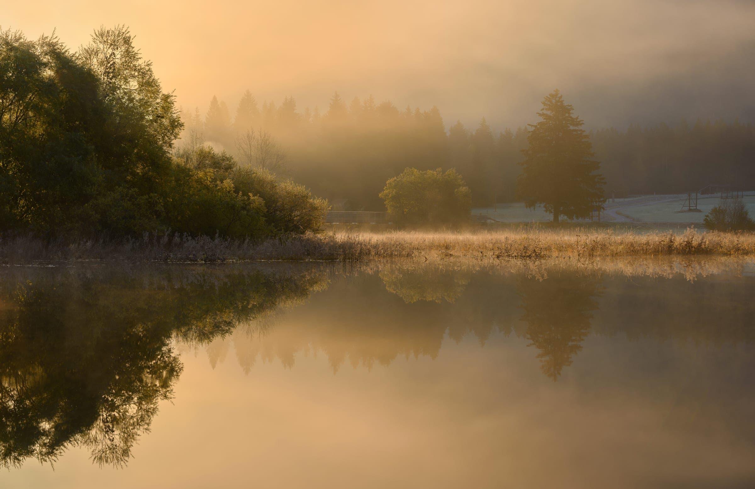
Layers of light, shape and composition align between the lenses until the picture holds. Each direction is a real optic of the land: water that ripples under your hand, a crystal lens that bulges over the picture, a prism wake that tears the grid and splits its colours, a mosaic that smears cell by cell, light dust that scatters and drifts back. A photograph stays a photograph.
The Cathedral of Worlds
Where the land’s work is shown.
Every workshop on this page feeds one place: the finished sites, each in its client’s own colours, with a name, a description and a live link. Nothing there is a demonstration.
The machines here show what the studio can design; the showcase shows what it has delivered. We keep the two apart on purpose.
What this page shows is our new system, the way we build today. Sites we delivered before it may not include it.
Bring us a brand, or the need for one.
Tell us what you have. We will tell you what it could become, in its own colours.